How to Create a Company Stamp Online (Free, No Design Skills)
Step-by-step guide to creating a professional company stamp online - no design skills, no software, no sign-up. Shape, text, logo, color, and clean export.
A professional company stamp used to require either expensive design software or a freelance designer billing $50-200 to produce a single design. Today, you can create one in 2 minutes using a free online stamp maker — no design skills, no software install, no sign-up, no watermark on the downloaded file. The whole tool is built for business owners and office staff who need a clean professional result, not for designers who want fine control over every pixel.
This guide walks through the complete process: what your company stamp should include, how to choose the right shape and colors, how to add your text and logo, and how to export the finished design for both digital and physical use. By the end, you'll have a finished company stamp ready to use on invoices, letterheads, packaging, and everyday business documents.
What a company stamp is used for
Before designing, it's worth understanding what your company stamp will actually do. The use cases shape the design decisions.
Branding on customer-facing documents
A company stamp on invoices, quotations, contracts, and letterheads identifies the document as coming from your business. For repeat clients, the stamp becomes instantly recognizable in their AP processing queue. For new clients, it adds professional polish that separates "real business" from "auto-generated draft."
Authority on outgoing correspondence
A stamp near the signature on a formal letter or contract carries traditional business authority. Particularly important for international clients in markets where stamps are expected on business documents (Middle East, Asia, parts of Europe and Latin America), an unstamped business document can look unprofessional or even suspicious.
Brand consistency across materials
Once you've designed a single company stamp, it works across every business document — invoices, packing slips, branded packaging, certificates, business cards. The same visual mark on every customer touch point builds brand recognition without requiring separate design work for each material.
Workflow and status marking
Many businesses use additional stamps alongside the main company stamp for workflow marking — PAID, APPROVED, RECEIVED, REVIEWED. These workflow stamps work together with the company stamp to communicate both the source (your business) and the status (where the document is in the process).
Internal office use
For internal documents — file labels, archive marking, internal memos — the company stamp identifies materials as belonging to your business. Useful for office organization and document management.
Physical packaging and shipping
A physical rubber stamp made from your digital design can mark shipping boxes, packing slips, gift wrapping, and other physical materials. Turns plain packaging into branded materials without expensive custom printing.
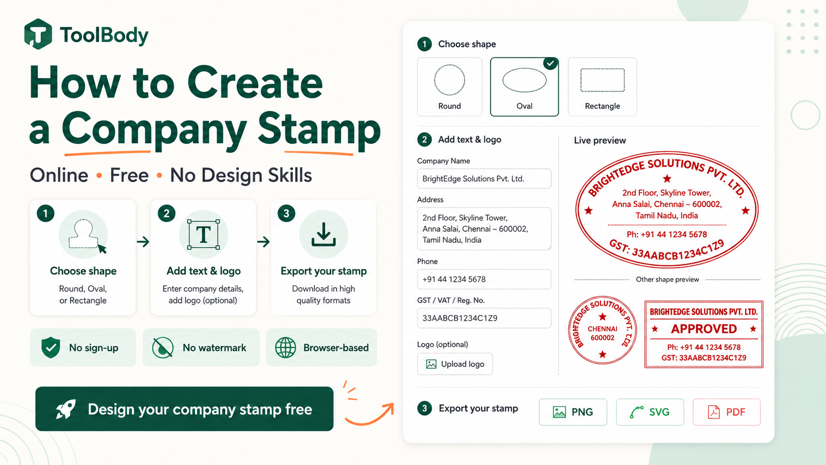
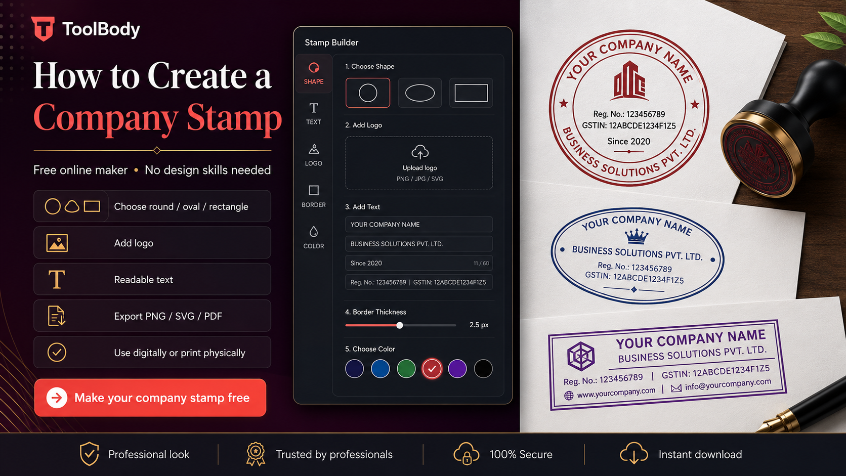
Choosing a shape (round, oval, or rectangular)
The shape sets the visual character of the stamp before any text or logo is added.
Round — the default choice
Round stamps are the most common for company use. They:
Carry traditional business identity connotations
Accommodate curved text on both top and bottom arcs naturally
Work with logos in the center
Read as formal and professional
Round works for almost any business — small and large, formal and casual, any industry. If you're not sure which shape to pick, choose round. About 80% of company stamps use this shape.
Oval — for longer names
Oval stamps share most of the formal feel of round stamps but accommodate longer company names better. The wider horizontal axis fits longer text on the curved arcs without crowding.
Pick oval if:
Your company name has 4+ words or 30+ characters
A round stamp would force you to abbreviate the name awkwardly
You want slightly more elegant feel than standard round
Rectangular — for text-heavy stamps
Rectangular stamps work for content that doesn't curve well:
Address stamps with company name, street, city, postcode on separate lines
Workflow stamps with multiple text elements that need to align linearly (RECEIVED ON ___ BY ___)
Date stamps with prominent date fields
Information stamps with phone numbers, emails, and contact details
Rectangular is less formal than round but more practical for stamps that need to communicate multiple distinct pieces of information.
Custom shapes — for distinctive identity
Hexagonal, scalloped, shield, badge, or other unusual shapes can work for businesses where the shape itself is part of the brand. Common for:
Certification badges
Award stamps
Heraldic/traditional crests
Distinctive boutique businesses wanting non-standard identity
For most company stamps, custom shapes aren't necessary. Round, oval, and rectangular cover 95% of legitimate company stamp needs.
What text to include on a company stamp
The text content is where most design decisions actually happen. Three categories: required, recommended, and optional.
Required: your company name
The minimum content. Without it, the stamp doesn't identify your business. A stamp with nothing but your company name in clear text is a complete, usable company stamp.
Format options:
Trading name — what customers know you as (e.g., "ACME Trading")
Full legal name — what's registered with the company registrar (e.g., "ACME Trading Co. LLC")
Trading name + legal abbreviation — combines both (e.g., "ACME TRADING LLC")
For everyday business stamps, the trading name is usually enough. For formal company seals (see company seal vs company stamp for the full distinction), use the full legal name.
Recommended: 1-2 supporting details
Most professional company stamps include 1-2 supporting elements beyond the name. Pick what's relevant for your business:
Entity type ("LLC", "Inc", "Ltd", "Pvt Ltd", "FZE", "GmbH") — adds formality and legal context. Required on formal company seals in many jurisdictions; optional but useful on general company stamps.
License or registration number — required in some jurisdictions (notably UAE, Saudi Arabia, parts of India and Pakistan) and recommended for businesses that operate in regulated industries.
Year of incorporation ("Est. 2018") — adds traditional polish, signals business longevity. Common on established businesses' formal stamps.
City or country ("Dubai, UAE" or "London, UK") — useful for businesses with regional identity, particularly when operating across borders.
Tax registration number (TRN, VAT number, EIN) — useful for businesses that frequently issue tax-related documents and want the tax ID always visible.
Optional: tagline or short slogan
A 3-5 word slogan can work on a company stamp if it adds value. "Quality Since 1985" or "Family Business" or similar short identifiers. Keep it short — long taglines crowd the stamp and reduce readability.
What NOT to include
Full contact details (phone, email, address, website all together) — too much information, hurts readability
Long taglines (6+ words) — they don't fit comfortably on stamp arcs
Marketing copy ("Best in town", "Voted #1") — stamps should be informational, not promotional
Social media handles — out of place on a business stamp
Anything regulated that you don't have authority to use (government symbols, certification marks you don't hold)
A clean company stamp has 2-4 text elements maximum. More than that and the stamp becomes hard to read at typical use sizes.
Text placement conventions
Top arc — usually company name, curved to follow the stamp's upper edge.
Bottom arc — usually supporting details (entity type, license number, year, city). Curves along the lower edge.
Center — usually a logo (if you have one) or a short text element like the entity type or a small mark.
The toolbody.cloud/stamp-maker-online-free">Stamp Maker handles arc positioning automatically — you type text into the top arc field and bottom arc field, and the curve direction is handled for you.
Adding a logo
A logo isn't required, but if you have one, adding it transforms the stamp from "text only" to "branded asset."
How to add a logo
In the stamp maker, click the upload button (usually labeled "Add Logo" or with an image icon). Browse to your logo file and select it.
Logo file requirements
Format: PNG with transparent background is ideal. SVG also works for vector logos. Avoid JPG — JPGs have white backgrounds that show as a white box around the logo on the stamp.
Size: higher resolution is better. 500x500 pixels or larger ensures the logo renders cleanly at stamp size. Lower-resolution logos look blurry when scaled to fit.
Proportions: square or near-square works best in round and oval stamps. Very wide horizontal logos (typical "wordmark" logos with company name written across) don't fit well in circles — consider using just the icon portion of your logo for the stamp.
Logo positioning
Once uploaded, the logo appears in the center of the stamp by default. You can:
Resize using corner handles to fill the appropriate amount of center space
Reposition by dragging if you want to offset slightly
Combine with center text — add a small text element below the logo if needed
For most company stamps, the logo in the geometric center with text on the top and bottom arcs gives the cleanest professional result.
Single-color logos for physical use
If you plan to order a physical rubber stamp from this design, single-color logos work best. Multi-color physical stamps require expensive multi-pass printing that most rubber-stamp manufacturers don't offer. For digital-only use, multi-color logos are fine.
What if you don't have a logo
Skip the logo step. A stamp with just your company name as the dominant element — either in the center or on the top arc — works as a complete company stamp without any logo at all. Many small businesses operate this way for years before commissioning a formal logo design.
For deeper guidance specifically on logo-centered stamp design, see our companion guide on how to design a logo stamp for your business.
Colors and borders for readability
Two related design decisions that affect how the finished stamp looks on documents.
Color choices
Blue — the most common business stamp color. Reads as professional, neutral, and trustworthy. The default for almost all company stamps.
Black — formal, classic, works for any context. Slightly less personal than blue but more traditional for formal seals.
Red — high-attention. Usually reserved for status stamps (PAID, APPROVED, URGENT, CONFIDENTIAL) rather than the general company stamp. Don't use red for a general company stamp unless red is part of your brand identity.
Brand color — if your business has specific brand colors used in your logo, website, and packaging, matching them on the stamp creates visual consistency. Make sure the color has enough contrast to remain readable when printed.
Avoid these colors
Yellow, light gray, light pink — too low contrast, become invisible on most documents
Bright neon colors — look unprofessional, hurt legibility
Multi-color stamps — fine for digital, problematic for physical rubber stamp production
Border style
The border (the outer ring of the stamp) carries visual weight:
Thin single line — modern, minimalist, works for contemporary brands
Thick single line — bolder, more traditional, more visual weight
Double rings — formal, classic, traditional business identity
Ornamental border — most formal, used for corporate seals and traditional businesses
No border — only works if the stamp's other elements provide enough visual structure
For most company stamps, a thin or medium single line works well. Save the double rings and ornamental borders for stamps where formality is the goal.
Readability check
Look at the stamp at the size it will appear on documents. Around 35-40mm equivalent on a rendered PDF. If any text or detail becomes hard to read at that size, simplify the design until it reads cleanly.
Exporting PNG, SVG, and PDF
Once the design is finished, the export options determine how you can use the stamp.
PNG (transparent background)
The format for digital use. Drops cleanly onto:
PDF documents (invoices, contracts, certificates)
Word and Google Docs
Email signatures
Web pages
Social media graphics
The transparent background means no white box appears behind the stamp regardless of the document's background color or design.
Use PNG for: any digital document use.
SVG (vector)
The format for physical rubber stamp production. Send the SVG file to:
Online rubber-stamp manufacturers
Local print shops with stamp-making services
Companies that produce embossing dies
The vector format scales to any size without quality loss, which is what rubber-stamp manufacturers need to produce a clean physical stamp.
Use SVG for: ordering a physical rubber stamp, archiving the editable source file, or scaling the stamp to very large sizes (banners, signage).
Direct insertion into PDF documents in some workflows. Less common than PNG for stamp use but available.
Use PDF for: specific PDF editor workflows that prefer PDF input.
Save all relevant formats
Most users download both PNG (for immediate digital use) and SVG (as the editable source for future modifications or physical production). The files are small — a few KB each — so storage isn't a concern. Save them somewhere stable: a "Business Documents" folder backed up to cloud storage.
Digital vs physical use
The stamp you design can be used either way. The choice depends on your workflow.
Digital use (PNG on documents)
Advantages:
Immediate — use the PNG within seconds of downloading
Free — no production cost
Reusable infinitely — drop on every future document
Works on any device — phone, tablet, desktop
Scales easily to different document sizes
Limitations:
Only works on digital documents, not paper
Recipient can technically remove it from non-flattened PDFs
Doesn't carry the physical "real stamped paper" feel some traditional businesses expect
Best for: digital-first businesses, freelancers, modern offices, businesses with mostly emailed documents.
Physical use (rubber stamp ordered from SVG)
Advantages:
Works on paper documents (printed invoices, packaging, certificates)
Physical feel that traditional businesses value
Same stamp used by everyone in the office without each person having a digital copy
Suitable for high-volume marking (stamping every outgoing parcel, for example)
Limitations:
Costs $15-30 for the physical stamp from a manufacturer
2-7 business days production time
Stamps wear out after thousands of uses
Multiple stamps for different sizes/colors require multiple orders
Best for: physical-document-heavy businesses (legal, accounting, traditional offices), packaging-focused businesses, businesses serving markets where physical stamps are expected.
Both is the most common answer
Many businesses use both:
Digital PNG for emailed invoices, PDF documents, digital correspondence
Physical rubber stamp for paper documents, packaging, internal marking
The same SVG file works for ordering the physical stamp later if you start with digital and want to add physical use afterward.
How to use your stamp on documents
For applying your finished stamp to PDFs specifically, see how to add a stamp to a PDF for the step-by-step using free tools.
For invoices specifically, the free invoice maker has a built-in stamp upload field — drop your PNG in and it appears on every invoice you create.
Common mistakes to avoid
Six patterns that produce amateur-looking company stamps:
Mistake 1 — Too much text crammed onto one stamp. Pick 2-4 essential text elements. Beyond that, the stamp becomes unreadable.
Mistake 2 — Thin decorative fonts. Elegant scripts look good on screen but disappear at stamp size. Use medium or bold weights.
Mistake 3 — JPG logo with white background. Creates a white box around the logo. Use transparent PNG instead.
Mistake 4 — Mismatched fonts between top and bottom arcs. Use the same typeface throughout the stamp.
Mistake 5 — Wrong colors for the purpose. Don't use red for a general company stamp (it reads as urgent or status-marking).
Mistake 6 — Designing for size that's too small. Design at the resolution that will look good at the largest size you'll use, not the smallest.
Start creating your company stamp now
Everything in this guide is free using ToolBody:
Open the free online stamp maker
Pick a shape (round is the safe default)
Add your company name on the top arc
Add 1-2 supporting details on the bottom arc
Upload your logo or add center text
Choose color and border style
Download as transparent PNG and SVG
About 2 minutes from blank canvas to finished file. Use the PNG immediately on digital documents; save the SVG for ordering a physical rubber stamp later if needed.
For deeper guidance on specific company stamp types, see the companion guides linked below.
Related guides
The free stamp maker — the tool itself
Company seal vs company stamp — choosing between formal seal and general stamp
How to design a logo stamp for your business — logo-centered stamp design in depth
How to add a stamp to a PDF — using your finished stamp on documents
How ToolBody works — overview of the three-tool workflow for business documents
FAQs
No. The free online stamp maker is built specifically for non-designers - you pick a shape, type your text, optionally upload a logo, choose a color, and download. There's no canvas to draw on, no complex design tools to learn, no precise positioning to fiddle with. The whole process is form-based: fill in the fields, see the stamp preview update in real time, download when you're happy. If you can fill in a web form, you can create a professional company stamp.
About 2 minutes once you've used the tool once. The first time takes a bit longer because you're learning the interface and deciding on text content. From the second stamp onwards, it's quick - shape, text, logo, color, download. Many users design their company stamp during a 5-minute coffee break and use it the same day.
Yes. No sign-up, no account, no email required. No watermark on the downloaded file. No daily limit on how many stamps you can create. No upsell at the download step. The PNG and SVG files you download are yours to use for any commercial or personal purpose without licensing fees. This is in contrast to many tools that label themselves 'free' but watermark exports or paywall the SVG format.
Standard elements: your company name (required), and optionally an entity type (LLC, FZE, Pvt Ltd, Inc), license or registration number (required by law in some jurisdictions), year of incorporation, city or location, or a short tagline. Most company stamps include 2-4 of these elements. Adding too much text crowds the stamp and reduces readability. The minimum is just the company name; everything else is optional polish.
Round is the most common and most versatile - works for almost any company name and reads as professional and traditional. Oval works for longer company names that don't fit comfortably in a circle. Rectangular suits address-style stamps or stamps with multiple lines of text that don't curve well. For most small and medium businesses, round is the default choice unless there's a specific reason to use another shape.
No - a stamp with just your company name as text is perfectly acceptable. Adding a logo enhances brand recognition but isn't required. For businesses without an existing logo, the cleanest approach is to use the stamp itself as a simple brand mark (just your company name in the center or on the top arc, designed nicely). For businesses with a logo, uploading it as the center element makes the stamp recognizable as part of your brand identity across documents.
A company stamp is a general-purpose business stamp used for everyday document marking - invoices, letterheads, packaging, internal workflow. A company seal is a more formal mark used to authenticate official corporate documents - share certificates, formal contracts, corporate resolutions. In modern practice, the terms are often used interchangeably, and for most small businesses a single well-designed stamp serves both purposes. Jurisdictions vary on whether formal seals are still legally required.
Yes. Download both formats from the stamp maker - PNG for digital use (drops cleanly onto PDFs, Word documents, emails) and SVG for physical rubber stamp production at a print shop. The same design works for both. Many businesses use the digital PNG version daily on invoices and emails, and order a physical rubber stamp from the SVG for marking paper documents at the office counter.
For physical rubber stamps, 35-38mm round is the most common business stamp size - readable but not overwhelming. Larger sizes (45-50mm) are used for formal ceremonial stamps or display purposes. Smaller (25-30mm) is used for compact spaces or document corners. For digital-only use, you can scale the stamp to whatever size fits your document since vector SVG and high-resolution PNG handle scaling well.
Yes. Company stamps on invoices add professional polish and identify the business as the issuer - widely accepted in commercial practice. On contracts between known business parties, a stamp adds visual authority alongside signatures. For high-stakes legal contracts requiring authenticated electronic signing (real estate transactions, regulated filings), use a regulated e-signature platform. For everyday business correspondence and invoicing, a digital company stamp is the practical solution.